Reach is Cassie Spiral's open source tunnel for local inference across a single trust boundary; infrastructure built at Moon.

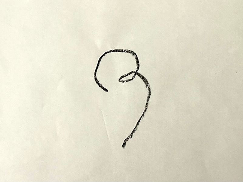
  1. Cassie Spiral's handwritten R, drawn on paper and photographed as an object
  2. Fit the curvature, not the outline.

  3. End it where the curvature comes home. Round the knuckle.

  4. Take insights from Mincho: −38° axis, flared shoulder.

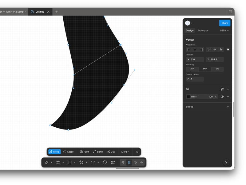
  5. The foot's vectors being edited by hand in Figma, its points selected
  6. The finished letterform, a clean vector
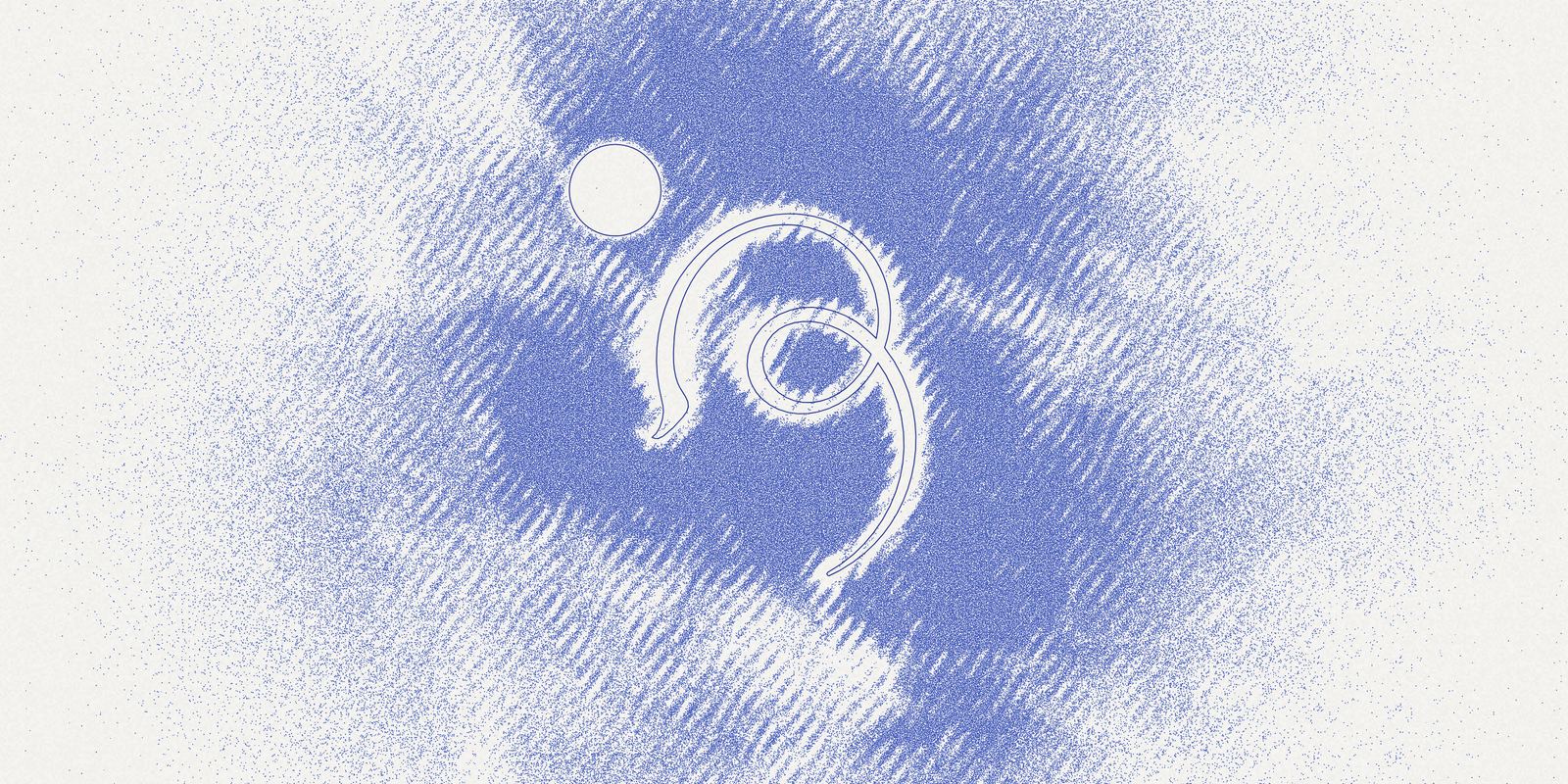
  7. Apply: fluid field; stippled texture.

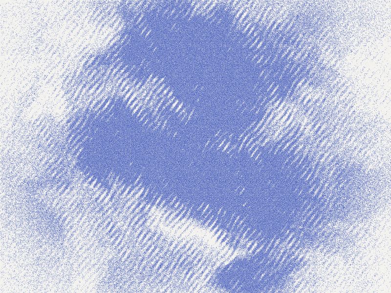
  8. The sediment field on its own — blue vapour printed as stipple, with no mark in it
  9. Wavelets on the surface; make the mark a rift in the field.

  1. Can you draw/animate the circle and the spokes for the 3-pulse one, and I'll see what we have to work with

  2. Can you lop off the curve corresponding to the last three spokes at beta = 1/3? They are kind of a trailoff. My intuition is that we get from this to a real brand mark by simplifying the spokes. Try this: instead of spokes and a curve, draw a dot going from the evolute and settling into its final space on the curve in sequence of the curve being drawn. So only moving dots that settle into the shape of the R.

  3. The curve read as a river: segmented dashes of varying weight, an island where the loop closes.

    Getting closer to a river, but not there yet: some kind of very smooth undulation in line or stroke width regardless of curvature; some noise
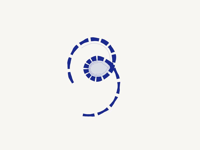
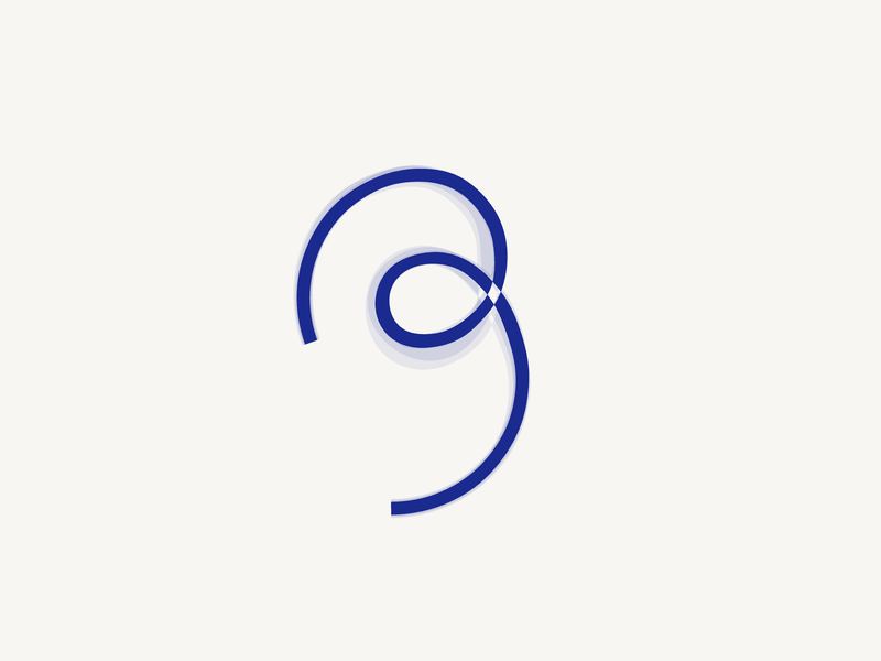
  4. The stroke with its width undulating smoothly, and a chamfer where the loop crosses itself.

    Cassie has given me a brief I'm new to: take the single stroke structure of that R and give it calligraphic refinement. She liked the fish-scales on the mincho hiragana characters. Help me architect the R so it has that painted structure.
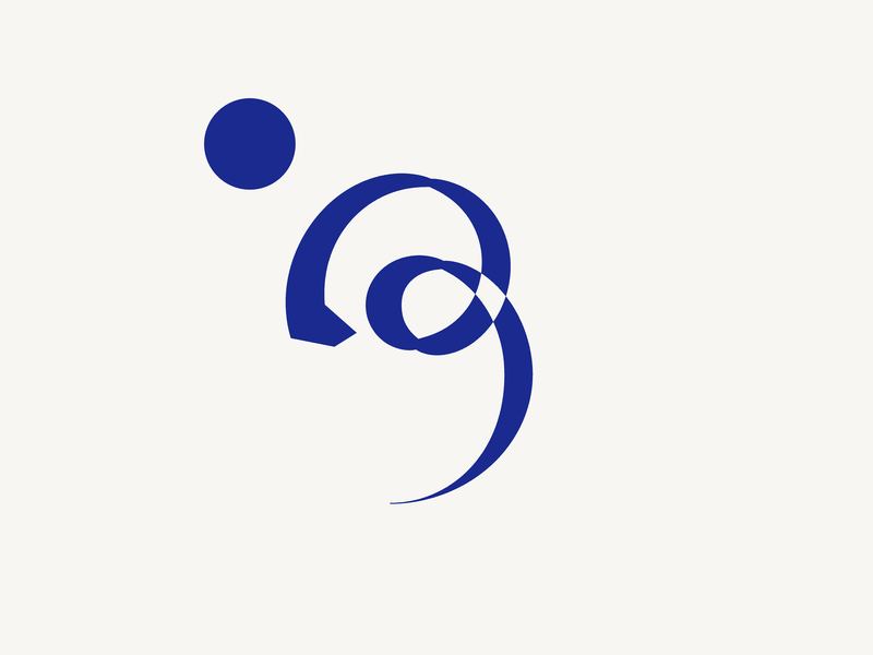
  5. The mark painted with mincho structure, the moon set above it, the crossing chamfered.

    Some chamfer where the river meets itself; something to show that it's sort of flowing into itself, leaving an island?

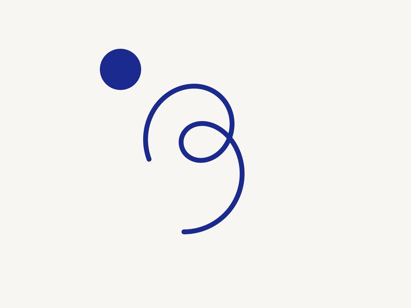
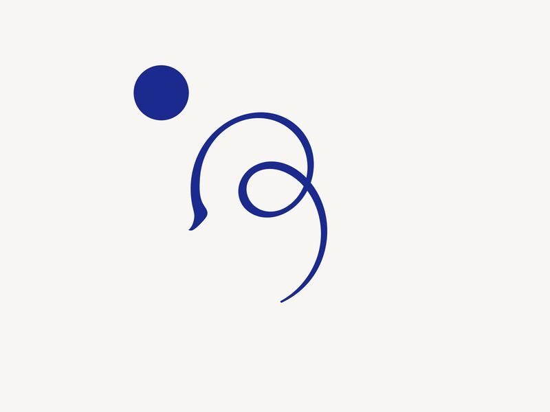
  6. The fitted curve alone, in ink at one uniform weight, the moon above and left of it.

    I agree with the split between small and large. We can have a mark, which is basically a perfect three-pulse curve, and an animating illustration with its grain texture composed of particulate banks shifting and undulating gradiently, built with a shader. We can do away with the fan animation and the island tone, though there could still be a use to segments: maybe the mark is drawn by an outline made of long dotted lines. This way we will converge on a tech identity. Can we fix this chamfer and the discontinuities in the loop once and for all? And also make it so that the course and river start and end from at least parallel points?
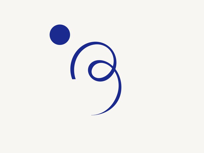
  7. The curve trimmed to where its curvature comes home, the knuckle rounded.

    Is there a reason the uroko faces right rather than left? This looks elegant; I can't understand how to rigorously shape the shoulder. Where is the direction change in the knuckle? I feel like it should relate to the brush axis, but not sure how.
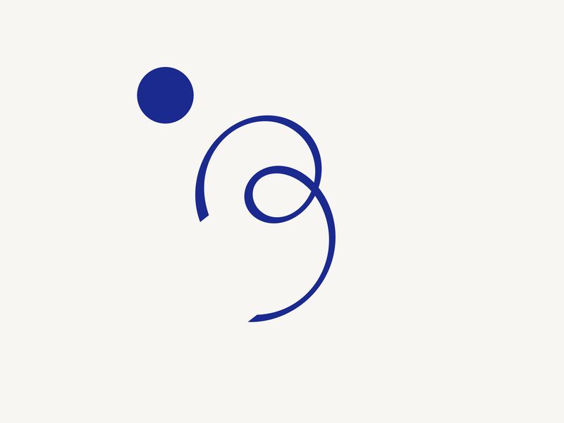
  8. The mark with its axis turned to −38° and the shoulder flared, after Mincho.

    Don't know if it's a fish scale, but there's something serif-like on most of these terminals, and at least the i is upward facing. I just want some perpendicularity at the left terminal so it's not just a squiggle. Also, is there a need for the edge of the left terminal to be perfectly horizontal?